
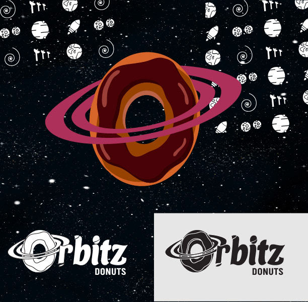
Orbitz Donuts
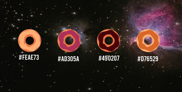
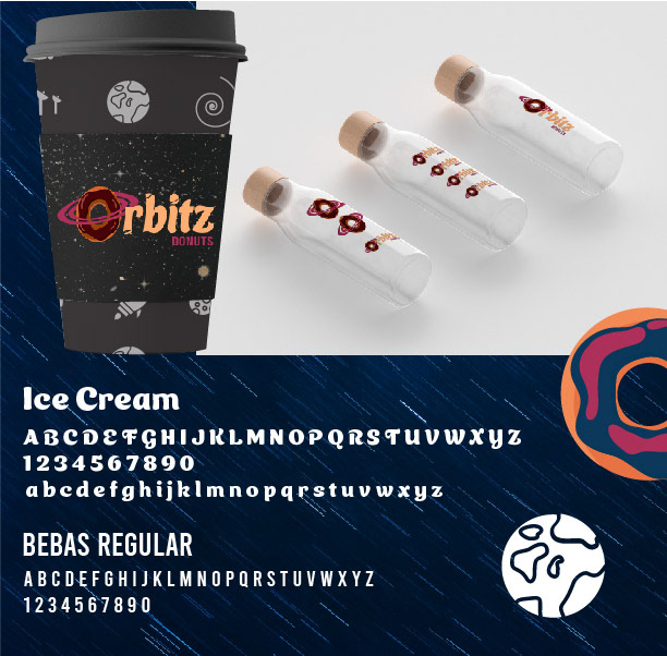
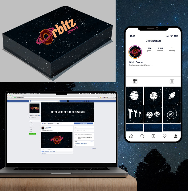
This brand aimed to have a strong presence and a concept that combined both space and the products offered. With the name already chosen, an analysis was conducted to determine which elements could be used. It was decided to make the most of the letter 'O,' giving it the shape of both a planet and a donut—an element that can be identified with the brand either as part of the full logo or as an independent element. Additionally, the challenge was to choose a color palette that was both space-themed and appetizing. The result is a deep and clear identity.


